 It's wonderful to revisit
gaming worlds we have been to before. It's even better to go back in a new way. That's of
course assuming the new way still keeps all the basics of the original. Yoshi Touch
& Go takes us to the vastly under appreciated world of Yoshi's Island,
but there are too many obvious and critical flaws for it to even have a chance.
It's wonderful to revisit
gaming worlds we have been to before. It's even better to go back in a new way. That's of
course assuming the new way still keeps all the basics of the original. Yoshi Touch
& Go takes us to the vastly under appreciated world of Yoshi's Island,
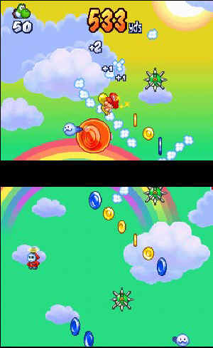
but there are too many obvious and critical flaws for it to even have a chance. There are two types of gameplay here: falling baby Mario and platforming Yoshi. They're basically the same game, just one is vertical, the other horizontal. This is not an adventure game, so remove any bright memories of the SNES Mario World sequel now. This is game based on high scores and time attacks.
There's nothing directly wrong with that, though it's hard to argue a standard story progression mode wouldn't have added greatly to this game. As it is, you'll keep both Yoshi and whining baby Mario away from danger by drawing clouds on the touch screen. Mario has no defense. As he free-falls, you need to maneuver him around coins and enemies. Various mainstays of the Koopa clan variety can be tossed after drawing a circle around them. Other obstacles need to be worked around.
Yoshi can launch eggs, jump, hover, and slowly plod along to the goal. His portion of the game offers a little more excitement, yet even that is dampened by the boring (but necessary to the game) pace. Both of these characters have the tendency to get stuck constantly, which can throw off your pace, require multiple re-draws as clouds disappear, and make simple maneuvering a pain.
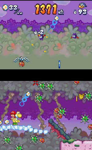 Mario's portion is even more frustrating. This segment should not
move horizontally at all. It's hard, if not impossible, to determine where the baby needs
to go. So much of the viewing area is cut off as Mario moves towards the edges, the screen
going with him. It's inexcusable, and bad design. Circling enemies in clouds is also
frustrating. The game is far too finicky about what a circle is.
Mario's portion is even more frustrating. This segment should not
move horizontally at all. It's hard, if not impossible, to determine where the baby needs
to go. So much of the viewing area is cut off as Mario moves towards the edges, the screen
going with him. It's inexcusable, and bad design. Circling enemies in clouds is also
frustrating. The game is far too finicky about what a circle is. The art style here isn't as surprising or as prevalent as it was in the previous Yoshi/Mario title. The crayon and marker look is still intact. It's just not the focus anymore. The game is crying out for more of this, at least to give it something to ease the frustration. Using both screens, there's little here that's worth mentioning. The animation follows the rest of the game: fine, just not very special.
Typical of the Nintendo way, the music here is upbeat and catchy. Yoshi's groaning as you make him hover detracts from that a bit, especially as you move deeper into the game. The sound effects haven't changed otherwise.
Yes, this game uses the DS's touch screen as it should. Unfortunately, that's not always going to translate into a great game. There are too many basic design flaws, and nearly all of them are basic, obvious, and unforgivable. With work, there's a pleasant sequel hiding in here. Until that happens, this one is a pass.